7 Online Fundraising Ideas for Great Landing Pages
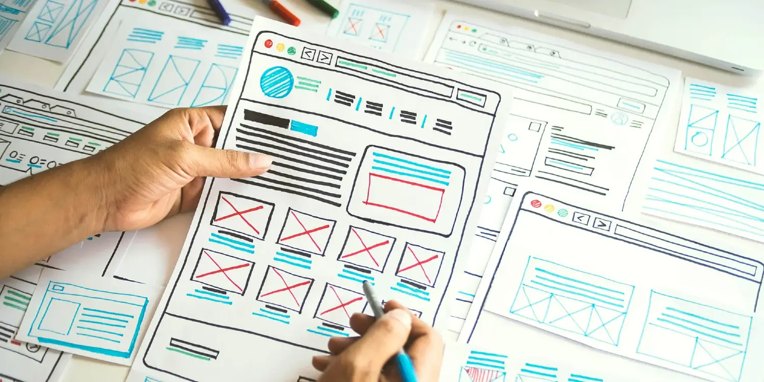
It's time to bring out your inner designer. After looking through user experience design research specific to nonprofits and their donation pages, we have narrowed it down to these 7 tips. Use these ideas to help give your online fundraising page a "wow" factor that will have visitors jumping for the donate button!
Include the right information
According to the Nielsen Norman Group's donation page usability research, donors want to know two main things: what your organization's goals are, and how your organization will use their money. These two things need to be easy to find on your donation page, well-written, and honest.
Simplify the information architecture
The Nielsen Norman Group also found that "unintuitive information architecture, cluttered pages, and confusing workflow" were cause for 47% of donation page usability problems. Usability.gov says that information architecture "focuses on organizing, structuring, and labeling content in an effective and sustainable way." Basically, you have to make sure that the information on your page is laid out in an obvious flow that makes it easy to follow and read.
Use your own branding
Nonprofits Source's online giving statistics list states that "custom-branded donation pages nested inside a nonprofit’s website raise 6X more money." This speaks to the importance of using your own branding on your donation page. Make sure the page fits in with the rest of your site, uses the correct color scheme, is typed up in the correct fonts, and showcases your logo.
Make the donation button obvious
Top Nonprofits says that donors should be able to see the donate button as soon as they come to your donation page. Even if your information architecture is simple and you have the right information, you still need a button that stands out. Get creative with the wording, placement, and structure of your button. Take a look at our online fundraising tools blog post for links to creative tools you can use.
Offer donor levels
Having pre-created donation level options makes the whole process easier for the donor. Designer Brad Frost suggests that most people don't know what a "typical and appropriate" donation looks like. Giving them some common denominations ($10, $25, $50, etc.) to choose from puts them at ease.
Consolidate the donation process
Once you have donor levels and an obvious donation button, you should keep the rest to a minimum. Qgiv advises limiting it to a one-page form. "The easier the process," Qgiv notes, "the more likely a donor is to see it through to the end." Simplicity and few form fields lessen the likelihood of donor drop-off, giving your organization a better chance at getting more donations through your donation page.
Have a post-donation plan
What happens on your page after someone donates? Make sure you have a plan to make your new donor feel appreciated! We recommend redirecting to a branded thank you page. Read through this blog post for more tips on creating thank you pages. It's also a good plan to schedule an automatic thank you email. No matter what your follow-up plan is, it's important that their gift gives the donor a warm-fuzzy feeling.
Simple changes like these can vastly improve the user experience of your donation page and increase your online donations. After using these online fundraising ideas on your page, it's sure to have that "wow" factor!

