
If you work in nonprofit marketing, you probably already have guidelines for the kind of messaging you want potential donors to see. This messaging will stay consistent with Facebook, but the delivery may be a little different from what you are used to.
Act Natural
Your posts and ads should be conversational and fit in with other posts that show up in someone’s regular newsfeed. Overly “business-y” or “corporate” messaging is a dead giveaway. Keep posts short and casual, as if you are really talking to a prospective donor. Some accounts even “sign off” on their posts, ending their updates with things like “From [Name], [Organization]’s Executive Director.”
Using hashtags can also make your ads and posts seem more grounded. For a guide on creating posts and using hashtags with Millennials in mind, check out our Millennial Messaging Worksheet.
Less is More
Facebook has strict rules when it comes to its ads. Images you use as your creative content can only be 20% text (and, yes, their approval algorithm can detect text on an image)! Your creative content decides much of your ad performance. Media Cause suggests asking engaging questions to get your audience involved in a post. Try asking trivia questions or asking for your followers’ opinions on a new event idea. The answers may surprise you.
Look Your Best
Video works especially well on Facebook, but static images can be effective if you choose the right ones. When it comes to color schemes, try to avoid blues and grays that are similar to Facebook’s colors. Keep the image simple and eye-catching so it’s noticeable but not overwhelming. Let’s look at a couple of examples. Each of these pictures was found by using Creative Commons Search, which allows you to quickly and easily find royalty-free images.
Search Term: “Young Woman Smiling”


Can you tell which one is the better choice for a Facebook ad? If you guessed the first one, you are correct. The photo on the bottom is obviously a staged photo, and the grayish-white color scheme will make it blend into the background. The photo on the top is a better choice because it looks more natural, and there are more colors to contrast with the blues and grays on Facebook.
Search Term: “Group of Volunteers”
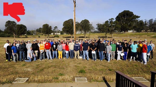
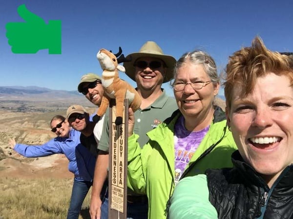
In this example, the better image is the bottom one. It showcases a small group of smiling, engaged volunteers. The fact that it is a selfie makes it look even more natural — it almost looks as if one of your Facebook friends could have posted it! On the other hand, the photo on the top has way too much going on. This is a photo that most people would scroll right past because there is no real focal point and it’s difficult to tell what’s going on.
In essence, the messaging you use for Facebook ads and even just regular posts must ring true to your cause. Focus on sounding real, keeping things short, and choosing the right imagery to get the clicks and engagement that your nonprofit needs.
Want to learn more about social media strategy for nonprofits? Download our Snapchat for Nonprofits Guide Book!

