4 Ways to Communicate Your Cause With Nonprofit Web Design

Your nonprofit’s website is like one of your fellow employees. It, too, has a responsibility to constantly tell your organization’s story. Graphic and nonprofit web design tactics can help you visually communicate your cause to better reach potential volunteers and donors.
No more stock photos.
Before they even get a chance to read your mission statement, visitors to your nonprofit’s website will see the visuals that support your copy. These images are your chance to immediately capture the attention of potential donors and give them an idea of what your nonprofit does.
Stock photos are great for some things, but when it comes to conveying the impact your nonprofit has, they don’t belong on your home or donation page. These photos should be real. This means no fake smiles or obvious setups. Keep things natural by using photos from your everyday operations or special events.
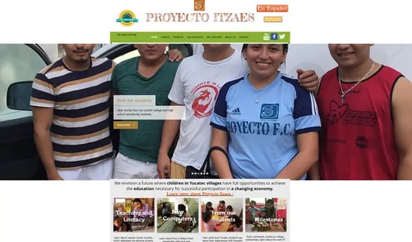
Here is an example from the Palo Alto nonprofit Proyecto Itzaes, which uses its homepage to show the kids they help:
Screenshot courtesy of Proyecto Itzaes.
Create multiple ways to engage.
Another way to communicate your cause with nonprofit web design is to create multiple ways to engage. Add more than just a homepage and address — regularly update your blog and events pages, including social media links, and have a succinct but thorough menu. Make sure that there is a place online for volunteers to sign up, for constituents to register for events, and for donors and potential donors alike to learn more about your impact.
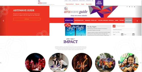
ArtsWave, a Cincinnati nonprofit, has a great example of this strategy on its homepage:
Screenshot courtesy of ArtsWave.
Simplicity is key.
Make your goal clear. Obviously placed donation buttons and clearly labeled subpages are essential to an easily navigable, user-friendly nonprofit website. The option to donate should be the first thing your site’s visitors see.
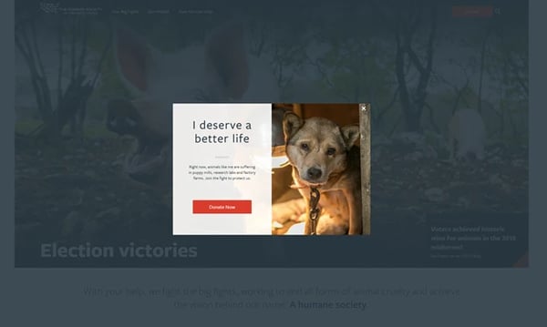
The Humane Society of The United States does this with a modal popup that appears when you first reach their site. Its simple title phrase, heart-tugging photo, and eye-catching donate button make a perfect example of a simple online ask.
Screenshot courtesy of The Humane Society of The United States.
Maintain your visual brand identity.
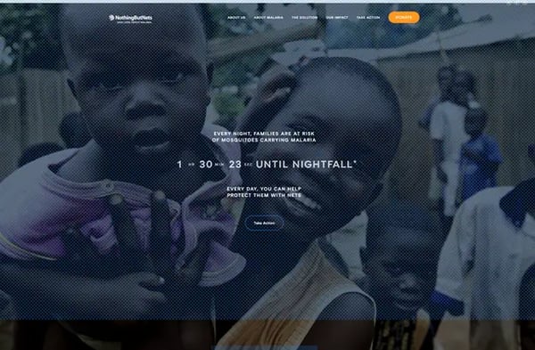
Every aspect of your website should remind donors of your cause. Nothing But Nets, an organization that provides mosquito nets to areas affected by malaria, does this beautifully with a “netting” motif throughout their site. Photos and buttons are accented by a blue net design on every page, constantly reminding site visitors what their mission is.
What is your organization’s motif? Whether it’s a specific color, shape, image, or design, you should take advantage of this simple way to communicate your cause and implement your motif in multiple parts of your website.
Screenshot courtesy of Nothing But Nets.
These examples are a great place to start, but I suggest you do some of your own nonprofit website research for inspiration! Find some sites you like that use these web design strategies and discuss them with your coworkers. Communicating your cause with nonprofit web design is a collaborative (and fun!) process that can result in more quality online donors.


