You’ve worked hard all year to improve your nonprofit. This improvement deserves to be recognized by the people that matter most – current and future donors. These examples from our blog post titled “9 of the Best Nonprofit Annual Reports of 2016” will guide you toward graphics that draw in readers at every level of your marketing funnel.
Don’t Just Place Text – Integrate It
There is a temptation to just slap text where it will fit. Especially at this busy time of year, this can seem like the easiest — and fastest — path to publishing your nonprofit annual report. Yet, text can’t go on the back burner if you want your report to stand out.
When you boil it down, the text is a graphic element just like any other shape, drawing, or photograph. It also impacts the visual flow. Text integration, as you can see in the examples from the cover of NPR’s 2016 annual report and an excerpt from the Sierra Club Foundation’s report, means using the text as a complement to your other visuals instead of a separate feature.
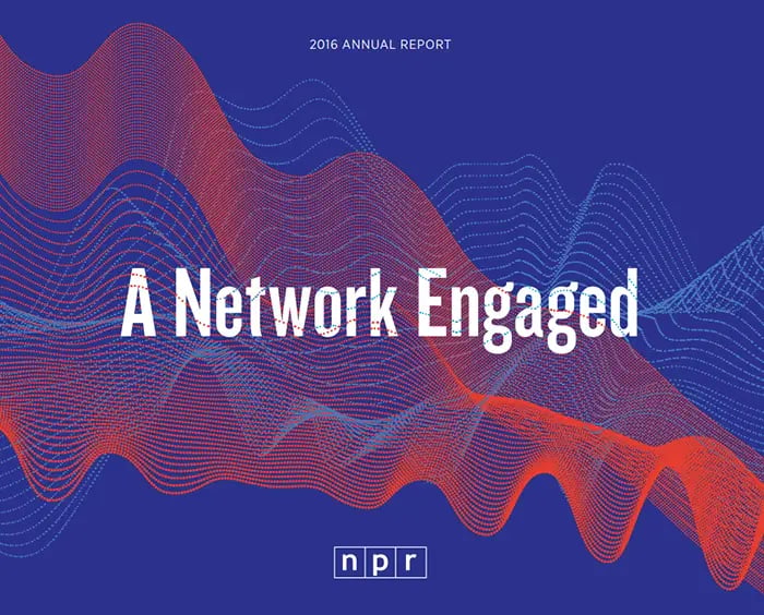
Photo courtesy of National Public Radio.
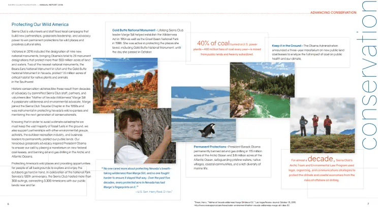
Photo courtesy of Sierra Club Foundation.
Infographics Are a Reader’s Best Friend
Ah, the infographic. All the best nonprofit annual reports seem to use them, but they still seem complicated to produce. Fortunately, infographics can be simple when you stick to two basic rules.
The first rule is to include as few elements as possible. You want the visuals to guide the reader to an understanding of the topic, not overwhelm them with intricate details. This means sticking to a limited color palate and favoring simple shapes, as in the Ashoka Scandinavia map example.
The second rule is to creatively integrate relevant imagery. AARP does this very well in its infographic about driver safety. They include cars in their visuals without getting too detailed.
If you are new to creating graphics, try out Canva's free account for nonprofits. Their infographic creator will simplify the process.
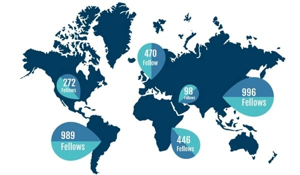

Photo courtesy of AARP.
Photos That Captivate
The photos in your annual report give readers a snapshot of the real-life impact of their donations. The images you include should not only be related to the story you are telling but should also be quality photographs.
Starting with the basics, all of your photos should be at least 300 dpi. "Dpi" stands for "dots per inch," and translates to the resolution of the photo. Next, think about the artistic qualities. Is the composition balanced? Is the focal point intriguing? Does it make the viewer want to know more? This list of the principles of design applied to photography will help you evaluate your photos.
In the examples below, artistic standards are met and the subject matter is relevant to the report. This is especially true in the case of the humpback whale photo from the Wildlife Conservation Society’s annual report, which is such an arresting image that readers are sure to linger on the page.
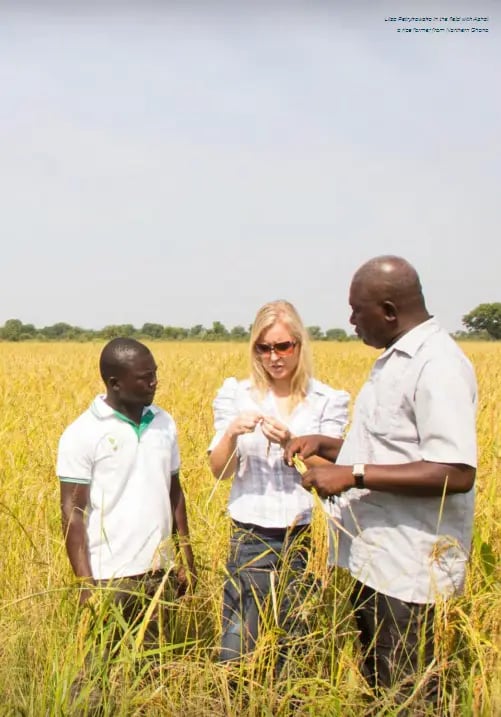
Photo courtesy of Ashoka Scandinavia.
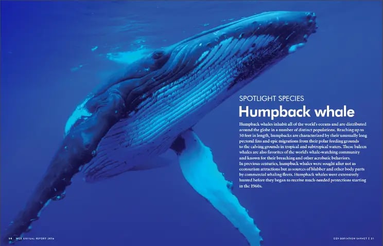
Photo courtesy of Wildlife Conservation Society.
No matter what industry you serve, adding the right images to your nonprofit annual report will make it stand out to current and future donors. Text, infographics, and photos all contribute to the message your report will send. Using these tools, that message will be as strong as possible.


